Meybohm Visual Identity
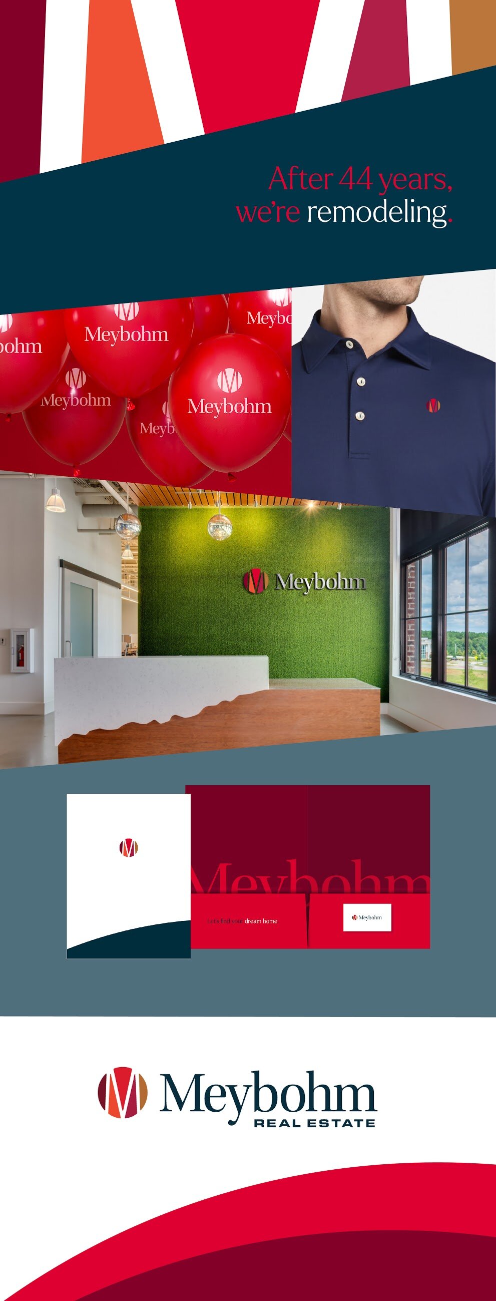
"Evolution, Not Revolution."
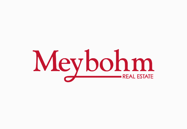
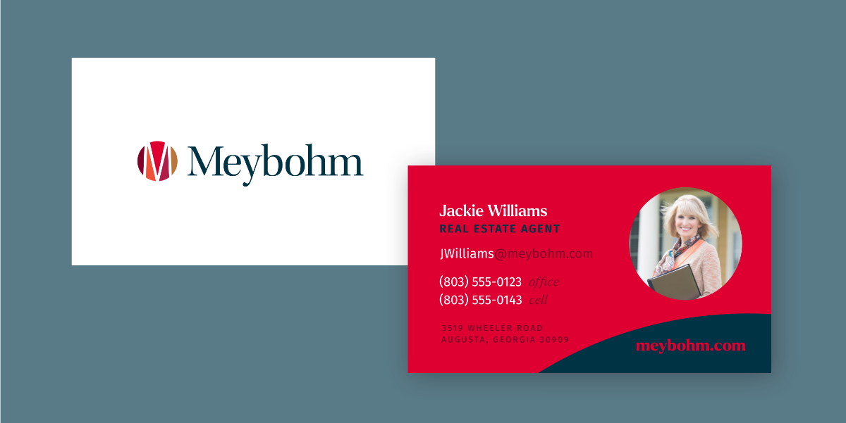
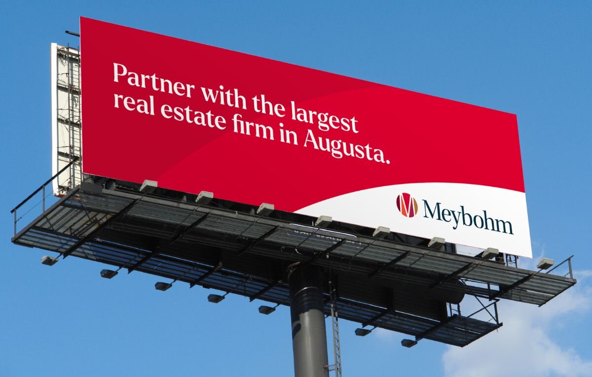
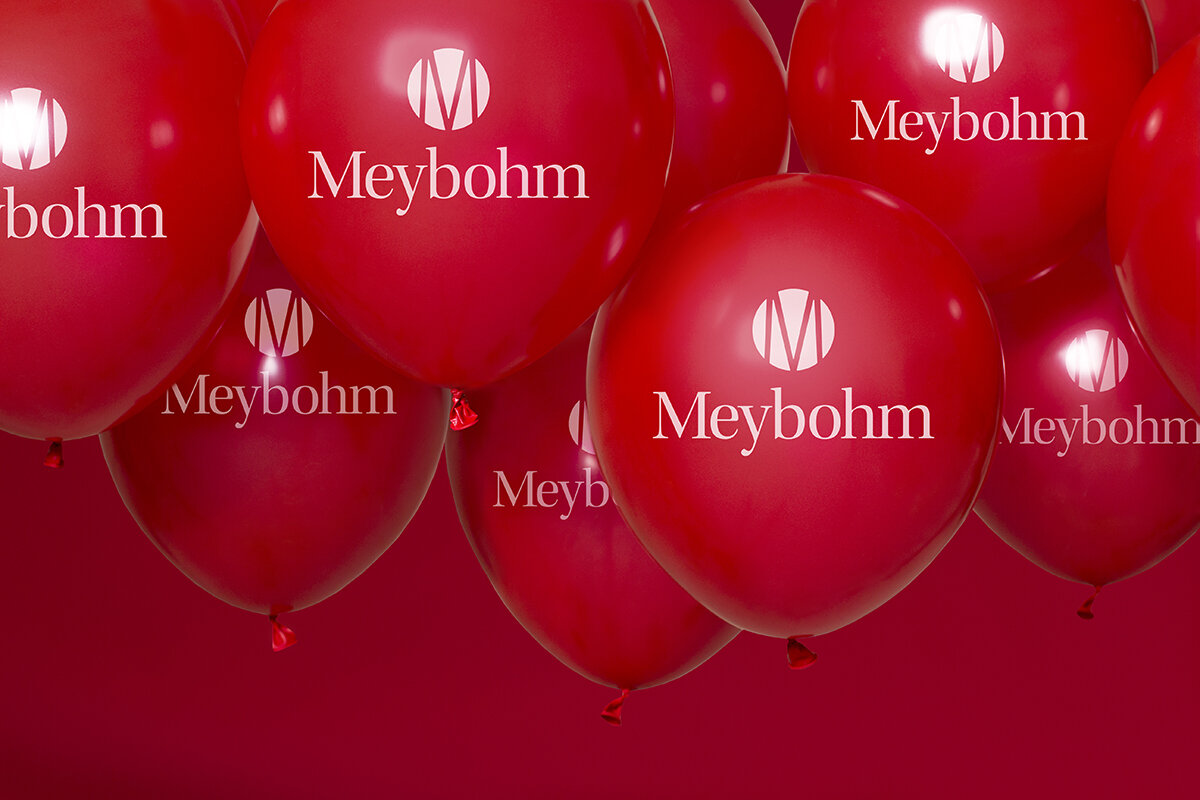
That was the central guiding principle when we set out to refresh Meybohm Real Estate's visual identity. With a 40-plus-year history in the CSRA, there was no way we were going to scrap all that brand equity. The new wordmark retains the ethos of the original serif mark with an open, friendly feel (and no squiggly y).

An Icon for an Icon
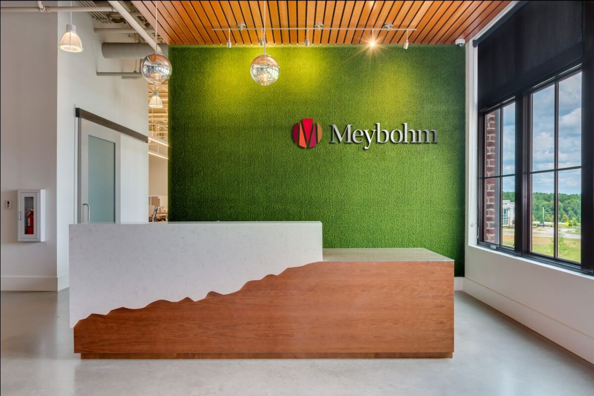
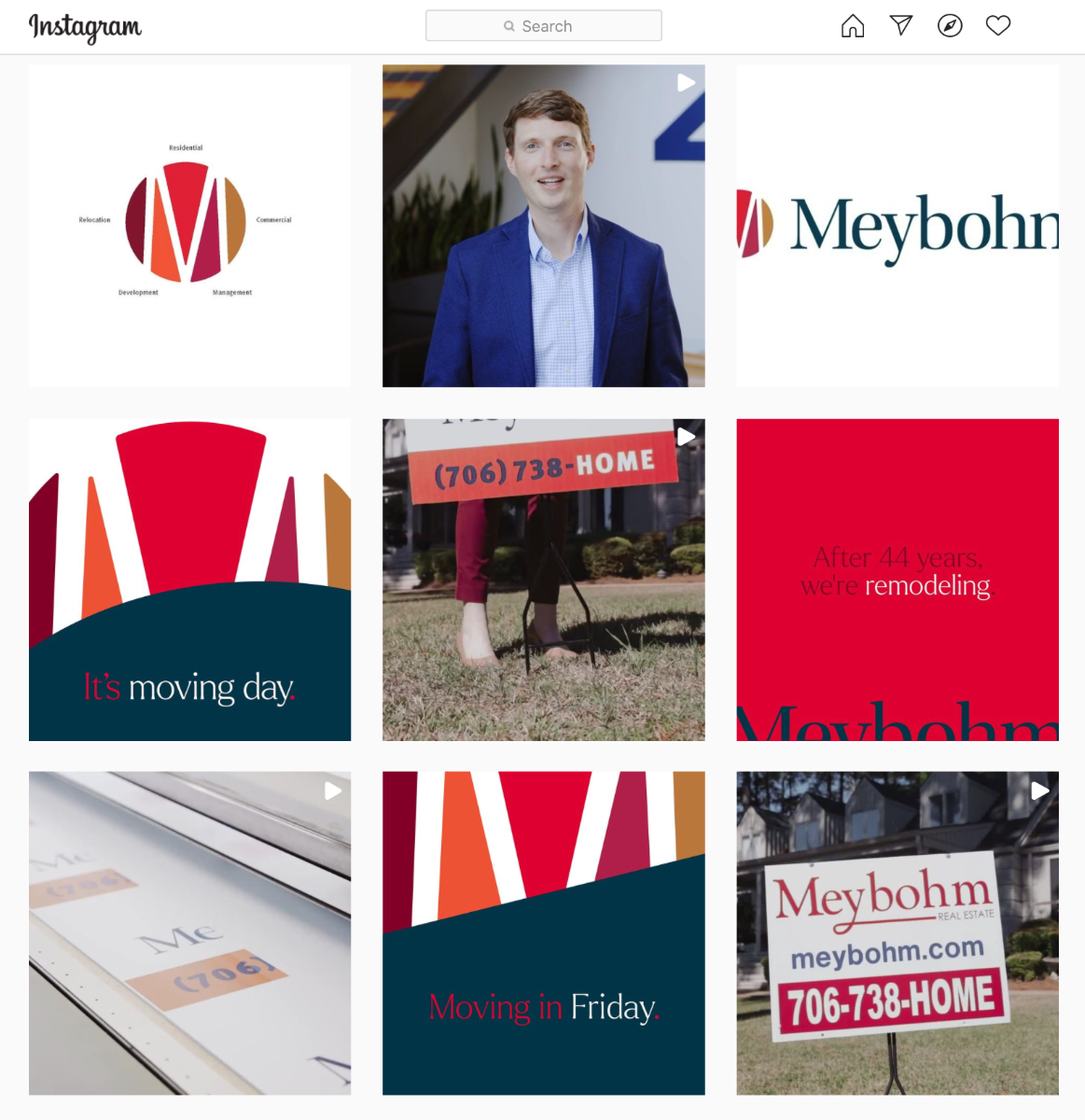
One of our favorite parts of this rebrand process was crafting an icon that both lends a pop of color and represents each of Meybohm's services. The 5 areas of Meybohm's expertise come together to make the Meybohm "M." Symbolic, no?


All Systems Go
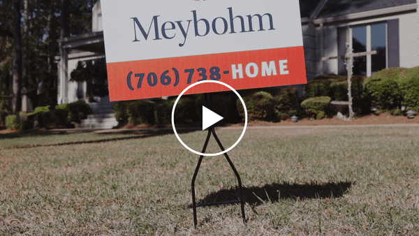
Once the brand was revealed internally, the Meybohm team was eager to launch and begin putting their new identity to work. We quickly created a launch plan to tease and reveal the brand using the company's most prominent advertising channel—the yard sign. Add in a couple cryptic graphics and an address from COO John Cates, and you have a brand reveal worthy of the area's largest real estate firm.


"Working with W/S on the evolution of our brand ultimately made us feel we were building our exciting future one proof at a time. The end result was greater than we envisioned and we felt their partnership gave us the confidence we needed to rebrand!"
Megan Moye / Chief Marketing Officer

"Tackling something as visually ubiquitous as Augusta's largest real estate brand is a rewarding challenge, and it was paramount to execute that exactly right. Meybohm has a tremendous amount of brand equity, and our task was to carry that forward while also reimagining and expanding the visual toolkit to set the brand up for many years of future success."
Rachel Baker / Designer