Skulicity Naming & Branding


A Data with Destiny
Skulicity is a groundbreaking SaaS platform created to address nuanced supply chain challenges through advanced data analytics and business intelligence. Previously known as Theta Retail, the platform was in need of a new name and a corresponding visual identity to clearly communicate the problems they solve for their customer base, and to keep pace with the powerful and high-end branding that effuses the tech industry.


And Sku Are?
Implying ease of use (simplicity), happiness (felicity), plus inventory management (sku), the brand is now poised with an approachable, friendly and smart personality to gain some serious traction in the market.
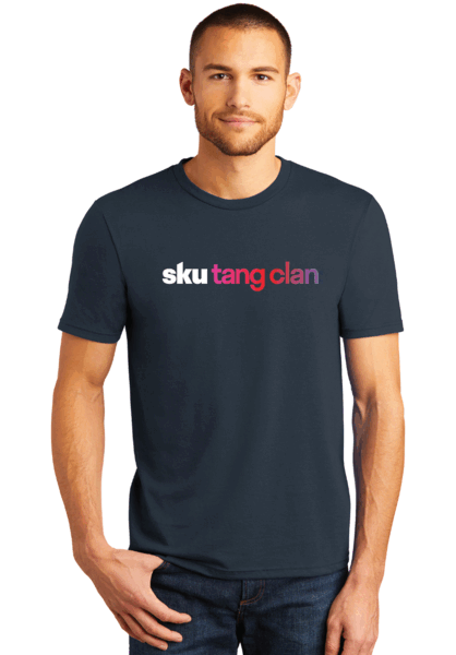
Living mostly in the digital / platform space means legibility at small sizes is paramount, and color does a lot of the heavy lifting. We designed a streamlined wordmark, a responsive icon that's a short-hand version of the logo, and selected color and type to reflect Skulicity's approachability and user-friendliness.


“Working with Skulicity has been an absolute blast. Their new identity encapsulates who they are and what they do effortlessly. Their brand colors emulate their friendly demeanor and outstanding customer service. We can't wait to see them grow.”
Ashley Cassedy / Account Manager


“Every brand presents a unique set of constraints, but that's where creativity thrives best. Imagining how Skulicity's design system would play out in a mostly-digital space allowed us to come up with some cool solves that elevate Skulicity from competitors.”
Rachel Baker / Brand Lead